Selections from Gold Pollen and Other Stories by Seiichi Hayashi (1968–72),
edited and translated by Ryan Holmberg (Picturebox, 2013)
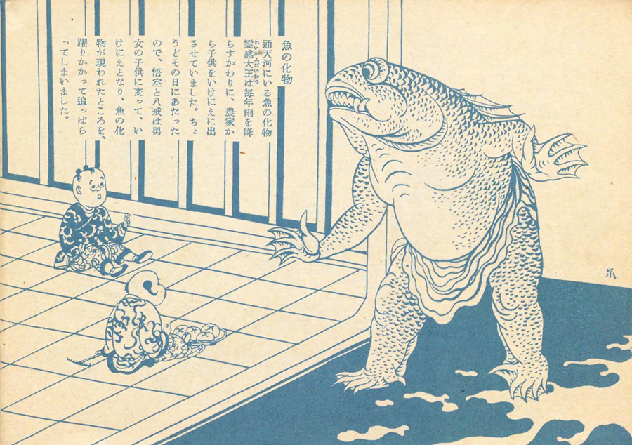
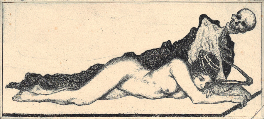
![]() Seiichi Hayashi, from "Gold Pollen" (1971)
From the publisher:Seiichi Hayashi was a leading figure in the hotbed of avant-garde artistic production of 1960s and early 70s Tokyo. He is best known for his lyrical and experimental manga for Garo, the famous alternative comics magazine. This volume collects a selection of Hayashi’s most important manga from this period, including Red Dragonfly (1968), Yamauba’s Lullaby (1968) and Gold Pollen (1971). [ed.: The other story is Dwelling in Flowers from 1972.] Published here in their original full color, these stories mix traditional Japanese aesthetics with Pop art sensibilities, and range in topic from the legacies of Japanese rightwing nationalism and World War II, to the pervasive influence of America over 1960s Japanese youth culture.
This first color reprinting of Hayashi’s work captures the vivid experimentation of Japanese art at this time. In addition, Hayashi’s youth and beginnings as an artist are illuminated by an autobiographical essay from 1972, translated here for the first time into English. Art historian Ryan Holmberg discusses Hayashi’s place in postwar Japanese art and manga, as well as his wider contributions to the Tokyo avant-garde as a designer and experimental animator. This lavishly illustrated book is likely to have widespread crossover appeal for design and fashion aficionados, as well as for students of the manga genre.
Seiichi Hayashi (born 1945) is best known for his lyrical and experimental manga for Garo, the famous alternative comics magazine. His animated films have been screened at The Museum of Modern Art, New York, among other institutions. Since the 1970s Hayashi has been a nationally revered illustrator, famous for his classically informed depictions of contemporary women and an important influence on acclaimed director Hayao Miyazaki, among others. Hayashi lives and works just outside of Tokyo.
I already miss Picturebox.
Seiichi Hayashi, from "Gold Pollen" (1971)
From the publisher:Seiichi Hayashi was a leading figure in the hotbed of avant-garde artistic production of 1960s and early 70s Tokyo. He is best known for his lyrical and experimental manga for Garo, the famous alternative comics magazine. This volume collects a selection of Hayashi’s most important manga from this period, including Red Dragonfly (1968), Yamauba’s Lullaby (1968) and Gold Pollen (1971). [ed.: The other story is Dwelling in Flowers from 1972.] Published here in their original full color, these stories mix traditional Japanese aesthetics with Pop art sensibilities, and range in topic from the legacies of Japanese rightwing nationalism and World War II, to the pervasive influence of America over 1960s Japanese youth culture.
This first color reprinting of Hayashi’s work captures the vivid experimentation of Japanese art at this time. In addition, Hayashi’s youth and beginnings as an artist are illuminated by an autobiographical essay from 1972, translated here for the first time into English. Art historian Ryan Holmberg discusses Hayashi’s place in postwar Japanese art and manga, as well as his wider contributions to the Tokyo avant-garde as a designer and experimental animator. This lavishly illustrated book is likely to have widespread crossover appeal for design and fashion aficionados, as well as for students of the manga genre.
Seiichi Hayashi (born 1945) is best known for his lyrical and experimental manga for Garo, the famous alternative comics magazine. His animated films have been screened at The Museum of Modern Art, New York, among other institutions. Since the 1970s Hayashi has been a nationally revered illustrator, famous for his classically informed depictions of contemporary women and an important influence on acclaimed director Hayao Miyazaki, among others. Hayashi lives and works just outside of Tokyo.
I already miss Picturebox.
![]() Seiichi Hayashi, from "Gold Pollen" (1971)
Seiichi Hayashi, from "Gold Pollen" (1971)![]() Seiichi Hayashi, from "Gold Pollen" (1971)
Seiichi Hayashi, from "Gold Pollen" (1971)![]() Seiichi Hayashi, from "Gold Pollen" (1971)
Seiichi Hayashi, from "Gold Pollen" (1971)![]() Seiichi Hayashi, from "Gold Pollen" (1971), blown-up panel
Seiichi Hayashi, from "Gold Pollen" (1971), blown-up panel![]() Seiichi Hayashi, from "Gold Pollen" (1971)
Seiichi Hayashi, from "Gold Pollen" (1971)![]() Seiichi Hayashi, from "Yamanba Lullaby" (1968)
Seiichi Hayashi, from "Yamanba Lullaby" (1968)![]() Seiichi Hayashi, from "Yamanba Lullaby" (1968)
Seiichi Hayashi, from "Yamanba Lullaby" (1968)![]() Seiichi Hayashi, from "Red Dragonfly" (1968)
Seiichi Hayashi, from "Red Dragonfly" (1968)![]() Seiichi Hayashi, from "Dwelling in Flowers" (1972)
Seiichi Hayashi, from "Dwelling in Flowers" (1972)![]() Seiichi Hayashi, from "Dwelling in Flowers" (1972)
This post first appeared on May 21, 2014 on 50 Watts
Seiichi Hayashi, from "Dwelling in Flowers" (1972)
This post first appeared on May 21, 2014 on 50 Watts
![]()
![]()
![]()
 Seiichi Hayashi, from "Gold Pollen" (1971)
From the publisher:Seiichi Hayashi was a leading figure in the hotbed of avant-garde artistic production of 1960s and early 70s Tokyo. He is best known for his lyrical and experimental manga for Garo, the famous alternative comics magazine. This volume collects a selection of Hayashi’s most important manga from this period, including Red Dragonfly (1968), Yamauba’s Lullaby (1968) and Gold Pollen (1971). [ed.: The other story is Dwelling in Flowers from 1972.] Published here in their original full color, these stories mix traditional Japanese aesthetics with Pop art sensibilities, and range in topic from the legacies of Japanese rightwing nationalism and World War II, to the pervasive influence of America over 1960s Japanese youth culture.
This first color reprinting of Hayashi’s work captures the vivid experimentation of Japanese art at this time. In addition, Hayashi’s youth and beginnings as an artist are illuminated by an autobiographical essay from 1972, translated here for the first time into English. Art historian Ryan Holmberg discusses Hayashi’s place in postwar Japanese art and manga, as well as his wider contributions to the Tokyo avant-garde as a designer and experimental animator. This lavishly illustrated book is likely to have widespread crossover appeal for design and fashion aficionados, as well as for students of the manga genre.
Seiichi Hayashi (born 1945) is best known for his lyrical and experimental manga for Garo, the famous alternative comics magazine. His animated films have been screened at The Museum of Modern Art, New York, among other institutions. Since the 1970s Hayashi has been a nationally revered illustrator, famous for his classically informed depictions of contemporary women and an important influence on acclaimed director Hayao Miyazaki, among others. Hayashi lives and works just outside of Tokyo.
I already miss Picturebox.
Seiichi Hayashi, from "Gold Pollen" (1971)
From the publisher:Seiichi Hayashi was a leading figure in the hotbed of avant-garde artistic production of 1960s and early 70s Tokyo. He is best known for his lyrical and experimental manga for Garo, the famous alternative comics magazine. This volume collects a selection of Hayashi’s most important manga from this period, including Red Dragonfly (1968), Yamauba’s Lullaby (1968) and Gold Pollen (1971). [ed.: The other story is Dwelling in Flowers from 1972.] Published here in their original full color, these stories mix traditional Japanese aesthetics with Pop art sensibilities, and range in topic from the legacies of Japanese rightwing nationalism and World War II, to the pervasive influence of America over 1960s Japanese youth culture.
This first color reprinting of Hayashi’s work captures the vivid experimentation of Japanese art at this time. In addition, Hayashi’s youth and beginnings as an artist are illuminated by an autobiographical essay from 1972, translated here for the first time into English. Art historian Ryan Holmberg discusses Hayashi’s place in postwar Japanese art and manga, as well as his wider contributions to the Tokyo avant-garde as a designer and experimental animator. This lavishly illustrated book is likely to have widespread crossover appeal for design and fashion aficionados, as well as for students of the manga genre.
Seiichi Hayashi (born 1945) is best known for his lyrical and experimental manga for Garo, the famous alternative comics magazine. His animated films have been screened at The Museum of Modern Art, New York, among other institutions. Since the 1970s Hayashi has been a nationally revered illustrator, famous for his classically informed depictions of contemporary women and an important influence on acclaimed director Hayao Miyazaki, among others. Hayashi lives and works just outside of Tokyo.
I already miss Picturebox.
 Seiichi Hayashi, from "Gold Pollen" (1971)
 Seiichi Hayashi, from "Gold Pollen" (1971)
 Seiichi Hayashi, from "Gold Pollen" (1971)
 Seiichi Hayashi, from "Gold Pollen" (1971), blown-up panel
 Seiichi Hayashi, from "Gold Pollen" (1971)
 Seiichi Hayashi, from "Yamanba Lullaby" (1968)
 Seiichi Hayashi, from "Yamanba Lullaby" (1968)
 Seiichi Hayashi, from "Red Dragonfly" (1968)
 Seiichi Hayashi, from "Dwelling in Flowers" (1972)
 Seiichi Hayashi, from "Dwelling in Flowers" (1972)
This post first appeared on May 21, 2014 on 50 Watts
Seiichi Hayashi, from "Dwelling in Flowers" (1972)
This post first appeared on May 21, 2014 on 50 Watts


 ca. 1960s, design by João da Câmara Leme
This third installment of Portuguese book covers pulls from livingdeadcovers, a website featuring 366 vintage covers from the collection of Jorge Silva. Jorge also blogs at Almanak Silva.
Previously: one, two.
ca. 1960s, design by João da Câmara Leme
This third installment of Portuguese book covers pulls from livingdeadcovers, a website featuring 366 vintage covers from the collection of Jorge Silva. Jorge also blogs at Almanak Silva.
Previously: one, two.
 1944, design by Roberto Santos
 1946, designer unknown
 1924, design by B. Correia
 1957, design by Victor Palla
 1959, design by Sebastião Rodrigues, photograph by Sena da Silva
 1932, design by Fred Kradolfer
 1930, design by Bernardo Marques
 1933, design by ARS (Adalberto Sampaio)
 1942, design by Júlio Amorim
 1942, design by António Domingues
 1961, design by João da Câmara Leme
 1960s, design by João da Câmara Leme,
via Ressabiator
1960s, design by João da Câmara Leme,
via Ressabiator
 1961, design by João da Câmara Leme
 1958, design by Victor Palla
 1960, design by Paulo Guilherme
 1963, design by Sebastião Rodrigues
 1942, design by ETP
 1924, design by Bernardo Marques
 1935, design by Roberto Nobre
 1924, designer unknown
 1945, design by Victor Palla
 1945, design by Victor Palla
 1958, design by Paulo Guilherme
 1963, design by Infante do Carmo
 1969, design by Lima de Freitas
 1970, design by José Brandão and Keith Trickett
 1971, design by Soares Rocha
See all book cover posts
This post first appeared on May 22, 2014 on 50 Watts
1971, design by Soares Rocha
See all book cover posts
This post first appeared on May 22, 2014 on 50 Watts
 frontispiece
From wikipedia:Alexandre Alexeieff (1901–1982) was a Russian-born artist, filmmaker and illustrator who lived and worked mainly in Paris. He and his second wife Claire Parker are credited with inventing the pinscreen as well as the animation technique totalization. In all Alexeieff produced 6 films on the pinscreen, 41 advertising films and illustrated 41 books. [cont. reading]
See all Alexeieff posts on 50 Watts
frontispiece
From wikipedia:Alexandre Alexeieff (1901–1982) was a Russian-born artist, filmmaker and illustrator who lived and worked mainly in Paris. He and his second wife Claire Parker are credited with inventing the pinscreen as well as the animation technique totalization. In all Alexeieff produced 6 films on the pinscreen, 41 advertising films and illustrated 41 books. [cont. reading]
See all Alexeieff posts on 50 Watts
 illus. for "Master and Man"
 illus. for "Master and Man"
 illus. for "How Much Land Does a Man Need?"
 illus. for "The Godson"
 illus. for "What Men Live By"
 illus. for "Where Love Is, God Is"
 illus. for "Two Old Men"
 illus. for "The Godson"
See all Alexeieff posts on 50 Watts
This post first appeared on May 27, 2014 on 50 Watts
illus. for "The Godson"
See all Alexeieff posts on 50 Watts
This post first appeared on May 27, 2014 on 50 Watts
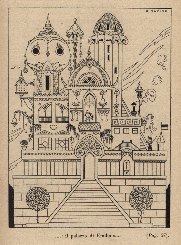
 Antonio Rubino, illus. for Tesoro Dorato (Golden Treasure) by H. C. Andersen (1911)
The first eight images in this post come from the database Indire: three from Tesoro dorato ed altri racconti, five from Pippo Sizza Aviatore.
Most of the remaining scans come from the wonderful book Antonio Rubino: I libri illustrati by Santo Alligo.
See all 50 Watts posts on the Italian illustrator Antonio Rubino (1880–1964).
Antonio Rubino, illus. for Tesoro Dorato (Golden Treasure) by H. C. Andersen (1911)
The first eight images in this post come from the database Indire: three from Tesoro dorato ed altri racconti, five from Pippo Sizza Aviatore.
Most of the remaining scans come from the wonderful book Antonio Rubino: I libri illustrati by Santo Alligo.
See all 50 Watts posts on the Italian illustrator Antonio Rubino (1880–1964).
 Antonio Rubino, illus. for Tesoro Dorato by H. C. Andersen (1911)
 Antonio Rubino, illus. for Tesoro Dorato by H. C. Andersen (1911)
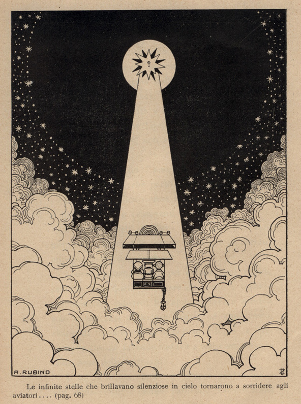 Antonio Rubino, illus. for Pippo Sizza Aviatore by Giuseppe Fanciulli (1910)
See the Pippo cover here
Antonio Rubino, illus. for Pippo Sizza Aviatore by Giuseppe Fanciulli (1910)
See the Pippo cover here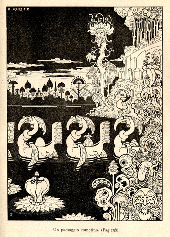 Antonio Rubino, illus. for Pippo Sizza Aviatore by Giuseppe Fanciulli (1910)
 Antonio Rubino, illus. for Pippo Sizza Aviatore by Giuseppe Fanciulli (1910)
 Antonio Rubino, illus. for Pippo Sizza Aviatore by Giuseppe Fanciulli (1910)
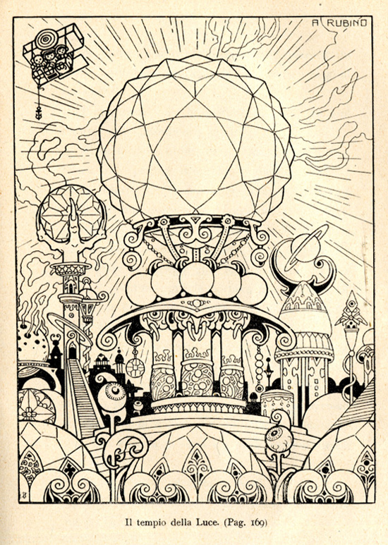 Antonio Rubino, illus. for Pippo Sizza Aviatore by Giuseppe Fanciulli (1910)
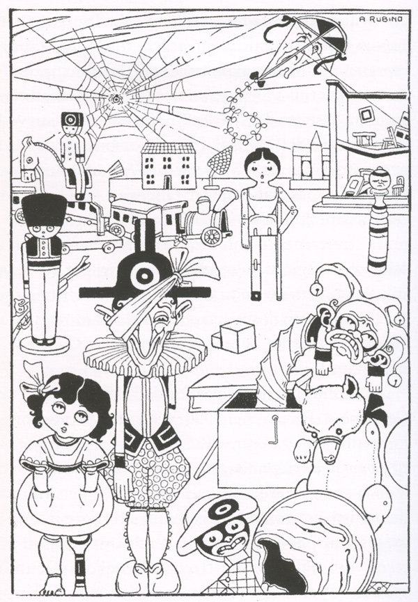 Antonio Rubino, illus. for Corriere dei Piccoli magazine (1912)
 Antonio Rubino, illus. for Madeo by Dante Dini (1912)
 Antonio Rubino, illus. for I balocchi di Titina (1912)
 Antonio Rubino, illus. for I balocchi di Titina (1912)
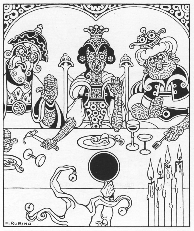 Antonio Rubino, illus. for I tre talismani by Guido Gozzano (1914)
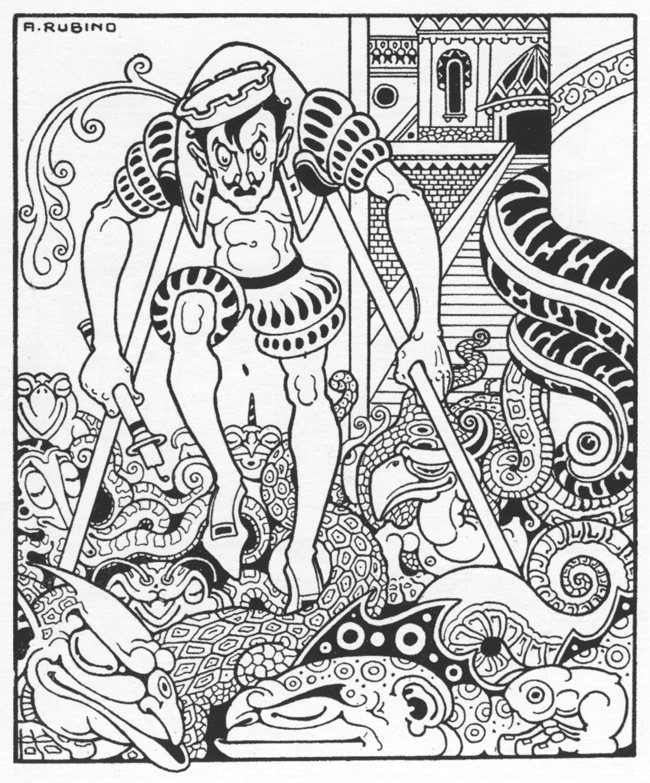 Antonio Rubino, illus. for I tre talismani by Guido Gozzano (1914)
 Antonio Rubino, illus. for Novelle by H. C. Andersen (1910)
 Antonio Rubino, illus. for Novelle by H. C. Andersen (1910)
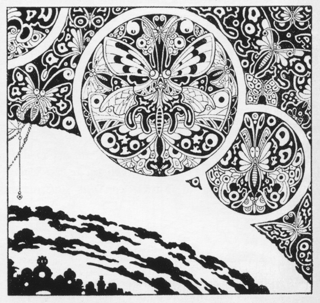 Antonio Rubino, 1911
 from Estasi, incubi e allucinazioni 1900-1920 via the now dormant blog
livres-en-liberte.blogspot.com
from Estasi, incubi e allucinazioni 1900-1920 via the now dormant blog
livres-en-liberte.blogspot.com from Estasi, incubi e allucinazioni 1900-1920 via the now dormant blog
livres-en-liberte.blogspot.com
from Estasi, incubi e allucinazioni 1900-1920 via the now dormant blog
livres-en-liberte.blogspot.com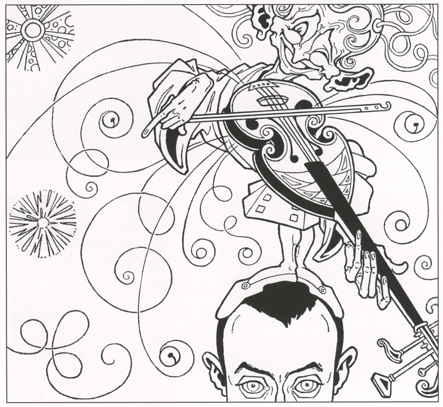 Antonio Rubino, self-portrait, "Scherzo per violino," 1911
See all posts on Rubino
See all posts tagged "Italy"
This post first appeared on May 28, 2014 on 50 Watts
Antonio Rubino, self-portrait, "Scherzo per violino," 1911
See all posts on Rubino
See all posts tagged "Italy"
This post first appeared on May 28, 2014 on 50 Watts
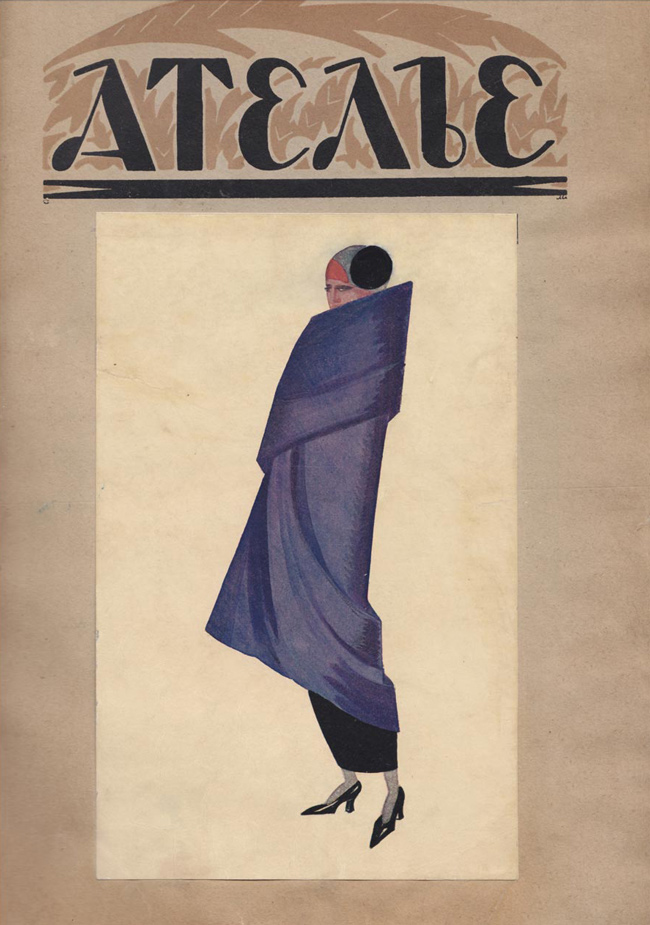 All Scans via livejournal user lobgott.
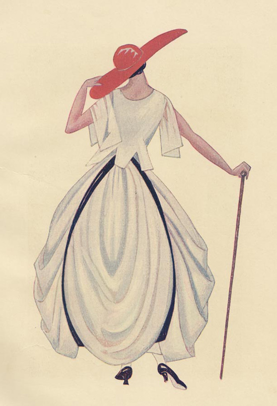
From Inna Fedorova's article "1920s Soviet fashion: Leather jackets and geometric patterns":At that time, Russia received its first fashion magazine, Atelier, created under the innovative Atelier Mod (Fashion House). Its main purpose and task were set out in an editorial article: “The active and tireless pursuit to identify all that is creatively perfect, that deserves the most attention in the sphere of material culture.”
The grandeur of conception was determined by just one list of stars who agreed to collaborate with the magazine — the artists Yury Annenkov, Boris Kustodiev, and Kuzma Petrov-Vodkin, the sculptor Vera Mukhina, the poet Anna Akhmatova and many others.
In addition to luxurious illustrations and advanced Constructivist models, the magazine offered an overview of current European trends, in which the Soviet control system saw “vestiges of capitalism.” The fashion magazine’s first issue was its last. If not for the excesses of Soviet censorship, Russia would now have its own Vogue and Harpers Bazaar all rolled into one.
More information (in Russian) at the Russian State Library.
All Scans via livejournal user lobgott.
From Inna Fedorova's article "1920s Soviet fashion: Leather jackets and geometric patterns":At that time, Russia received its first fashion magazine, Atelier, created under the innovative Atelier Mod (Fashion House). Its main purpose and task were set out in an editorial article: “The active and tireless pursuit to identify all that is creatively perfect, that deserves the most attention in the sphere of material culture.”
The grandeur of conception was determined by just one list of stars who agreed to collaborate with the magazine — the artists Yury Annenkov, Boris Kustodiev, and Kuzma Petrov-Vodkin, the sculptor Vera Mukhina, the poet Anna Akhmatova and many others.
In addition to luxurious illustrations and advanced Constructivist models, the magazine offered an overview of current European trends, in which the Soviet control system saw “vestiges of capitalism.” The fashion magazine’s first issue was its last. If not for the excesses of Soviet censorship, Russia would now have its own Vogue and Harpers Bazaar all rolled into one.
More information (in Russian) at the Russian State Library.


 This post first appeared on May 29, 2014 on 50 Watts
 Another harvest of images from one of my favorite artists, Walter Schnackenberg (1880–1961). I'm starting to wonder if a proper book overview of his work will even be published in my lifetime.
I pulled most of the images from various expired auction or bookseller listings of the rare publication Kostume / Plakate Und Dekorationen. It's currently selling for $4000 online so I'm satisfied with these somewhat scrappy photos and scans. It includes "31 color lithograph plates, eight photographic plates and five black and white plates of poster, advertising and costume design."
See all my posts on Schnackenberg
Another harvest of images from one of my favorite artists, Walter Schnackenberg (1880–1961). I'm starting to wonder if a proper book overview of his work will even be published in my lifetime.
I pulled most of the images from various expired auction or bookseller listings of the rare publication Kostume / Plakate Und Dekorationen. It's currently selling for $4000 online so I'm satisfied with these somewhat scrappy photos and scans. It includes "31 color lithograph plates, eight photographic plates and five black and white plates of poster, advertising and costume design."
See all my posts on Schnackenberg


 from Jugend
 from Jugend
 costume design
 costume design
 costume design
 in his studio with model
 for Jugend 1915
 for Jugend 1915
See all my posts on Schnackenberg
Repeated from the first post (Sept. 2008):
There doesn't seem to be much info on him on the web. Here's a bio from the non-site walterschnackenberg.com: Born in Bad Lauterburg in 1880, Walter Schnackenberg found his vocation as a draughtsman and painter while still very young. At 19 he went to Munich, where he at first attended Heinrich Knirr's painting school before going on directly, like so many of his contemporaries, to study at the Franz von Stuck Academy. Drawing is Schnackenberg's strong point. His lively imagination made him particularly good at caricature. He drew for the celebrated magazines 'Jugend' and 'Simplizissimus'. His themes were theatre and the comic muse. Travelling extensively, Schnackenberg often went to Paris, where he was especially interested in the work of Henri de Toulouse-Lautrec. As a print-maker, Schnackenberg devoted himself mainly to poster art and his most mature work is in this genre. He was also well-known as a designer of stage scenery and costumes. With his evident preference for frivolous ladies, he was highly fashionable in his day. Schnackenberg does not have the acutely critical approach of a Grosz or a Hubbuch. Instead, his works resemble those of Jeanne Mammen, who devoted herself to portraying pert Berlin girls. During the late phase of his career, Schnackenberg introduced surreal elements into his work. People with bestial, mask-like faces were intended to symbolize the unsatisfied lusts and addictions of the petty bourgeois. Schnackenberg spent his last years in Rosenheim and died there in 1961.
This post first appeared on June 5, 2014 on 50 Watts
for Jugend 1915
See all my posts on Schnackenberg
Repeated from the first post (Sept. 2008):
There doesn't seem to be much info on him on the web. Here's a bio from the non-site walterschnackenberg.com: Born in Bad Lauterburg in 1880, Walter Schnackenberg found his vocation as a draughtsman and painter while still very young. At 19 he went to Munich, where he at first attended Heinrich Knirr's painting school before going on directly, like so many of his contemporaries, to study at the Franz von Stuck Academy. Drawing is Schnackenberg's strong point. His lively imagination made him particularly good at caricature. He drew for the celebrated magazines 'Jugend' and 'Simplizissimus'. His themes were theatre and the comic muse. Travelling extensively, Schnackenberg often went to Paris, where he was especially interested in the work of Henri de Toulouse-Lautrec. As a print-maker, Schnackenberg devoted himself mainly to poster art and his most mature work is in this genre. He was also well-known as a designer of stage scenery and costumes. With his evident preference for frivolous ladies, he was highly fashionable in his day. Schnackenberg does not have the acutely critical approach of a Grosz or a Hubbuch. Instead, his works resemble those of Jeanne Mammen, who devoted herself to portraying pert Berlin girls. During the late phase of his career, Schnackenberg introduced surreal elements into his work. People with bestial, mask-like faces were intended to symbolize the unsatisfied lusts and addictions of the petty bourgeois. Schnackenberg spent his last years in Rosenheim and died there in 1961.
This post first appeared on June 5, 2014 on 50 Watts
 Kiyoshi Awazu, poster for Double Suicide, 1969 (Awazu on 50 Watts)
 Medea (1971)
 Kurosawa's own artwork for Dodes'ka-den (Clickety Clack), 1970
 Kurosawa's own artwork for Dodes'ka-den (Clickety Clack), 1970
 "Young Miss" (Ojo san) movie poster, 1930
via Pink Tentacle
The four posters from the sorely missed Pink Tentacle come from the Japanese-language book Modernism on Paper: Japanese Graphic Design of the 1920s-30s.
"Young Miss" (Ojo san) movie poster, 1930
via Pink Tentacle
The four posters from the sorely missed Pink Tentacle come from the Japanese-language book Modernism on Paper: Japanese Graphic Design of the 1920s-30s.
 "May 1" movie poster by Hiromu Hara, 1928-1929
via Pink Tentacle
"May 1" movie poster by Hiromu Hara, 1928-1929
via Pink Tentacle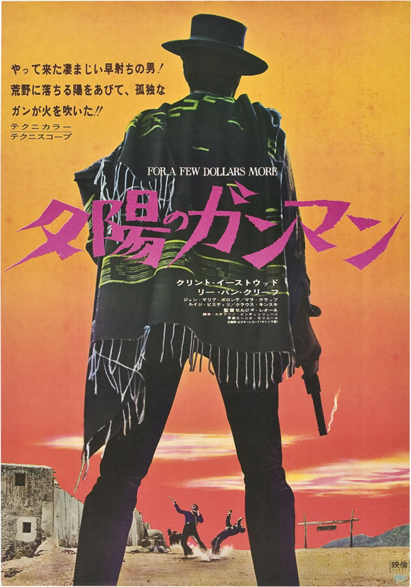 For a Few Dollars More, 1967
 A Fistful of Dollars, 1965
 Shoot the Piano Player, 1960
 Masculin Féminin, 1966
via Zero Focus
Masculin Féminin, 1966
via Zero Focus
 The Birds, 1963
 Repulsion, 1965
 House, 1977
via Gurafiku
House, 1977
via Gurafiku Symphonie der Liebe, 1949
 Ecstasy, 1930s
 Kriemhild’s Revenge, 1925
via Pink Tentacle
Kriemhild’s Revenge, 1925
via Pink Tentacle
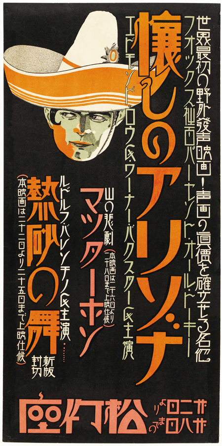 In Old Arizona, 1929
 Rififi, 1955
 Les Enfants Terribles, 1960s
 Django
 Onibaba, 1964
 Pokolenie, 1981
 Play it Again, Sam, 1972
 Fantastic Voyage, 1966
 The 1,000 Eyes of Dr. Mabuse, 1960
 The Ghoul, 1933
 c.1930s
"An intriguing piece of film history. Bound together in this unique volume is a collection of promotional material (mainly, 'Chirashi'), touting American films released in Japan in the early 1930s."
c.1930s
"An intriguing piece of film history. Bound together in this unique volume is a collection of promotional material (mainly, 'Chirashi'), touting American films released in Japan in the early 1930s."
 Kuroneko, 1968
 Wild Bunch, 1969
 Magazine ad for "Seishun Zukai" movie, 1931
via Pink Tentacle
The majority of the scans here are from expired auction listings at Heritage Auctions (ha.com). There's a whole blog of them too at JapaneseMoviePosters.
I put some Japanese horror movie posters on my tumblr. (Including one which makes Michael Myers look like a Simpsons character.)
This post first appeared on June 9, 2014 on 50 Watts
Magazine ad for "Seishun Zukai" movie, 1931
via Pink Tentacle
The majority of the scans here are from expired auction listings at Heritage Auctions (ha.com). There's a whole blog of them too at JapaneseMoviePosters.
I put some Japanese horror movie posters on my tumblr. (Including one which makes Michael Myers look like a Simpsons character.)
This post first appeared on June 9, 2014 on 50 Watts
 From wikipedia:Journey to the West is a Chinese novel published in the 16th century during the Ming Dynasty and attributed to Wu Cheng'en. It is one of the Four Great Classical Novels of Chinese literature. In English-speaking countries, the work is widely known as Monkey, the title of Arthur Waley's popular abridged translation.
The novel is an extended account of the legendary pilgrimage of the Tang dynasty Buddhist monk Xuanzang who traveled to the "Western Regions", that is, India, to obtain sacred texts (sūtras) and returned after many trials and much suffering. It retains the broad outline of Xuanzang's own account, Great Tang Records on the Western Regions but the Ming dynasty novel adds elements from folk tales and the author's invention, that is, that the Buddha gave this task to the monk and provided him with three protectors who agree to help him as an atonement for their sins. These disciples are Sun Wukong, Zhu Bajie, and Sha Wujing, together with a dragon prince who acts as Xuanzang's steed, a white horse.
Journey to the West has strong roots in Chinese folk religion, Chinese mythology, Taoist and Buddhist philosophy, and the pantheon of Taoist immortals and Buddhist bodhisattvas are still reflective of some Chinese religious attitudes today. Enduringly popular, the tale is at once a comic adventure story, a spring of spiritual insight, and an extended allegory in which the group of pilgrims journeys towards enlightenment which each of them can achieve only with the help of all of the others.
University of Chicago Press publishes a complete 4-volume translation.
The scans come from the database of the National Diet Library. It's divided into three volumes: one, two, three.
Illustrator Niō Mizushima (水島爾保布, 1884-1958) is the father of science fiction writer Kiodomari Allan.
Previously: The Monkey King
From wikipedia:Journey to the West is a Chinese novel published in the 16th century during the Ming Dynasty and attributed to Wu Cheng'en. It is one of the Four Great Classical Novels of Chinese literature. In English-speaking countries, the work is widely known as Monkey, the title of Arthur Waley's popular abridged translation.
The novel is an extended account of the legendary pilgrimage of the Tang dynasty Buddhist monk Xuanzang who traveled to the "Western Regions", that is, India, to obtain sacred texts (sūtras) and returned after many trials and much suffering. It retains the broad outline of Xuanzang's own account, Great Tang Records on the Western Regions but the Ming dynasty novel adds elements from folk tales and the author's invention, that is, that the Buddha gave this task to the monk and provided him with three protectors who agree to help him as an atonement for their sins. These disciples are Sun Wukong, Zhu Bajie, and Sha Wujing, together with a dragon prince who acts as Xuanzang's steed, a white horse.
Journey to the West has strong roots in Chinese folk religion, Chinese mythology, Taoist and Buddhist philosophy, and the pantheon of Taoist immortals and Buddhist bodhisattvas are still reflective of some Chinese religious attitudes today. Enduringly popular, the tale is at once a comic adventure story, a spring of spiritual insight, and an extended allegory in which the group of pilgrims journeys towards enlightenment which each of them can achieve only with the help of all of the others.
University of Chicago Press publishes a complete 4-volume translation.
The scans come from the database of the National Diet Library. It's divided into three volumes: one, two, three.
Illustrator Niō Mizushima (水島爾保布, 1884-1958) is the father of science fiction writer Kiodomari Allan.
Previously: The Monkey King


 Previously: The Monkey King
 Einar Nerman, from the Images Musicales collection
En gyllene medelväg, 1919
Einar Nerman, from the Images Musicales collection
En gyllene medelväg, 1919
 Einar Nerman, from the Images Musicales collection
Folie Tollie, not dated
Einar Nerman, from the Images Musicales collection
Folie Tollie, not dated Einar Nerman, from the Images Musicales collection
Tidens vaggsång, not dated
Einar Nerman, from the Images Musicales collection
Tidens vaggsång, not dated
 Einar Nerman, from the Images Musicales collection
Min lilla Wa-tah-wall, 1915
Einar Nerman, from the Images Musicales collection
Min lilla Wa-tah-wall, 1915 Einar Nerman, from the Images Musicales collection
Pastoral och parodi, 1932
Einar Nerman, from the Images Musicales collection
Pastoral och parodi, 1932 Einar Nerman, from the Images Musicales collection
Karavan, not dated
Einar Nerman, from the Images Musicales collection
Karavan, not dated Einar Nerman, from the Images Musicales collection
Min morgonsång, 1914
Einar Nerman, from the Images Musicales collection
Min morgonsång, 1914
 Einar Nerman, from the Images Musicales collection
Suzy, 1917
Einar Nerman, from the Images Musicales collection
Suzy, 1917 Einar Nerman, from the Images Musicales collection
Kullornas Vals, 1927
Einar Nerman, from the Images Musicales collection
Kullornas Vals, 1927 Einar Nerman, from the Images Musicales collection
Chong, 1919
Einar Nerman, from the Images Musicales collection
Chong, 1919 Einar Nerman, from the Images Musicales collection
Det finns en tagg på varje rosenstängel, not dated
Einar Nerman, from the Images Musicales collection
Det finns en tagg på varje rosenstängel, not dated
 Einar Nerman, from the Images Musicales collection
La même lune nous voit, 1917
Einar Nerman, from the Images Musicales collection
La même lune nous voit, 1917
 Einar Nerman, from the Images Musicales collection
Säg varför går du här och ger mig ögon?, 1916
Einar Nerman, from the Images Musicales collection
Säg varför går du här och ger mig ögon?, 1916
 Einar Nerman, from the Images Musicales collection
Carmencita, 1925
Einar Nerman, from the Images Musicales collection
Carmencita, 1925 Einar Nerman, from the Images Musicales collection
Det är vårens fel, 1912
Einar Nerman, from the Images Musicales collection
Det är vårens fel, 1912
 Einar Nerman, from the Images Musicales collection
En sjömansvals, 1918
Einar Nerman, from the Images Musicales collection
En sjömansvals, 1918
 Einar Nerman, from the Images Musicales collection
En sjömansdrill, 1920
Einar Nerman, from the Images Musicales collection
En sjömansdrill, 1920
 Einar Nerman, from the Images Musicales collection
Varför? - Därför! (Because!), 1925
Einar Nerman, from the Images Musicales collection
Varför? - Därför! (Because!), 1925
 Einar Nerman, from the Images Musicales collection
Allihop är de galna i mej! (They go Wild simply Wild over me), 1925
This is my fifth post on Swedish illustrator Einar Nerman. See them all here.
From wikipediaEinar Nerman (6 October 1888, Norrköping – 1983) was a Swedish artist. He was born and grew up in middle class family in the working-class city of Norrköping and was the younger brother of the Swedish Communist leader Ture Nerman. Einar Nerman also had a twin brother, Birger Nerman, who was an archeologist.
Einar Nerman dropped out of his Norrköping Gymnasium High School in 1905 and moved to Stockholm to study art. In 1908 he moved to France for many years to pursue his interest in art, studying with Matisse at the Academie Matisse in Paris.
When he came back to Sweden in 1912 he started studying music and taking dance lessons. In the 1920s Nerman lived in London and drew images for The Tatler. During World War II, he lived and worked in New York.
Einar Nerman wrote songs and music and composed music and to many of his brother Ture Nerman’s poems.
Einar Nerman also made illustrations for many of the books by Selma Lagerlöf. In Sweden today, he is mostly known, or unknown, for being the man behind the art of the Solstickan matchbox. He also made some famous drawings of Greta Garbo, one of which was used on a postage stamp in 2005, a hundred years after the moviestar's birth.
A book of his drawings appeared in 1976: Caught in the Act (Harrap, London) with an introduction by his friend, lyricist Sandy Wilson. It contained many caricatures of friends in the London theatre world. From 1922 to 1930 he was the theatre cartoonist for The Tatler and also worked for the fashionable magazine Eve.
See all posts tagged "Sweden" on 50 Watts
Previous post from this collection: Don't let your eyes tell lies
This post first appeared on August 7, 2014 on 50 Watts
Einar Nerman, from the Images Musicales collection
Allihop är de galna i mej! (They go Wild simply Wild over me), 1925
This is my fifth post on Swedish illustrator Einar Nerman. See them all here.
From wikipediaEinar Nerman (6 October 1888, Norrköping – 1983) was a Swedish artist. He was born and grew up in middle class family in the working-class city of Norrköping and was the younger brother of the Swedish Communist leader Ture Nerman. Einar Nerman also had a twin brother, Birger Nerman, who was an archeologist.
Einar Nerman dropped out of his Norrköping Gymnasium High School in 1905 and moved to Stockholm to study art. In 1908 he moved to France for many years to pursue his interest in art, studying with Matisse at the Academie Matisse in Paris.
When he came back to Sweden in 1912 he started studying music and taking dance lessons. In the 1920s Nerman lived in London and drew images for The Tatler. During World War II, he lived and worked in New York.
Einar Nerman wrote songs and music and composed music and to many of his brother Ture Nerman’s poems.
Einar Nerman also made illustrations for many of the books by Selma Lagerlöf. In Sweden today, he is mostly known, or unknown, for being the man behind the art of the Solstickan matchbox. He also made some famous drawings of Greta Garbo, one of which was used on a postage stamp in 2005, a hundred years after the moviestar's birth.
A book of his drawings appeared in 1976: Caught in the Act (Harrap, London) with an introduction by his friend, lyricist Sandy Wilson. It contained many caricatures of friends in the London theatre world. From 1922 to 1930 he was the theatre cartoonist for The Tatler and also worked for the fashionable magazine Eve.
See all posts tagged "Sweden" on 50 Watts
Previous post from this collection: Don't let your eyes tell lies
This post first appeared on August 7, 2014 on 50 Watts
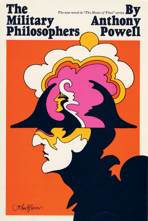 John Alcorn, cover for The Military Philosophers, 1968
art director: Sheridan Germann
credit: John Alcorn: Evolution by Design
Milton Glaser on John Alcorn: "The baby-faced designer with golden hands."
About the book, which was edited by Stephen Alcorn and Marta Sironi:John Alcorn - Evolution By Design is a celebration of the life and work of legendary graphic designer and illustrator, John Alcorn (1935-1992).
A never-before released overview of one of the most versatile designers of the 20th century, replete with revealing essays and several hundred images spanning over 4 decades, from the artist's formative years to his untimely death at age 56.
His unique style can be found in hundreds of books (Random House, Simon & Schuster, Rizzoli, Longanesi, Guanda) movie posters (Fellini’s “Amarcord”), magazines and record covers. Alcorn's career included a sound training at the Push Pin Studios, the celebrated design studio founded by Milton Glaser, Seymour Chwast, Reynold Ruffins, and Edward Sorel.
His work has been exhibited in various locations including The Louvre in Paris.
John Alcorn, cover for The Military Philosophers, 1968
art director: Sheridan Germann
credit: John Alcorn: Evolution by Design
Milton Glaser on John Alcorn: "The baby-faced designer with golden hands."
About the book, which was edited by Stephen Alcorn and Marta Sironi:John Alcorn - Evolution By Design is a celebration of the life and work of legendary graphic designer and illustrator, John Alcorn (1935-1992).
A never-before released overview of one of the most versatile designers of the 20th century, replete with revealing essays and several hundred images spanning over 4 decades, from the artist's formative years to his untimely death at age 56.
His unique style can be found in hundreds of books (Random House, Simon & Schuster, Rizzoli, Longanesi, Guanda) movie posters (Fellini’s “Amarcord”), magazines and record covers. Alcorn's career included a sound training at the Push Pin Studios, the celebrated design studio founded by Milton Glaser, Seymour Chwast, Reynold Ruffins, and Edward Sorel.
His work has been exhibited in various locations including The Louvre in Paris.
 John Alcorn, cover for From a View to a Death, 1968
art director: Martha Lehtola
credit: John Alcorn: Evolution by Design
John Alcorn, cover for From a View to a Death, 1968
art director: Martha Lehtola
credit: John Alcorn: Evolution by Design John Alcorn, “Charles Dickens, The Story of The Goblin Who Stole a Sexton”
The Push Pin Monthly Graphic, November 1957
credit: John Alcorn: Evolution by Design
John Alcorn, “Charles Dickens, The Story of The Goblin Who Stole a Sexton”
The Push Pin Monthly Graphic, November 1957
credit: John Alcorn: Evolution by Design
 John Alcorn, pharmaceutical illustration, c. 1960
credit: John Alcorn: Evolution by Design
John Alcorn, pharmaceutical illustration, c. 1960
credit: John Alcorn: Evolution by Design John Alcorn, design and illus. for The Abecedarian Book by Charles W. Ferguson, 1964
credit: John Alcorn: Evolution by Design
John Alcorn, design and illus. for The Abecedarian Book by Charles W. Ferguson, 1964
credit: John Alcorn: Evolution by Design John Alcorn, title design for Fellini's Amarcord, 1973
credit: John Alcorn: Evolution by Design
John Alcorn, title design for Fellini's Amarcord, 1973
credit: John Alcorn: Evolution by Design John Alcorn, unpublished poster for Fellini's Il Casanova, 1976
credit: John Alcorn: Evolution by Design
John Alcorn, unpublished poster for Fellini's Il Casanova, 1976
credit: John Alcorn: Evolution by Design John Alcorn, cover for Books! by Murray McCain, 1962
credit: John Alcorn: Evolution by Design
Books! was reprinted by Ammo last year.
John Alcorn, cover for Books! by Murray McCain, 1962
credit: John Alcorn: Evolution by Design
Books! was reprinted by Ammo last year.
 John Alcorn, spread for Books! by Murray McCain, 1962
credit: John Alcorn: Evolution by Design
John Alcorn, spread for Books! by Murray McCain, 1962
credit: John Alcorn: Evolution by Design John Alcorn, illustrations and design for Pocahontas in London by Jan Wahl, 1967
credit: John Alcorn: Evolution by Design
John Alcorn, illustrations and design for Pocahontas in London by Jan Wahl, 1967
credit: John Alcorn: Evolution by Design John Alcorn, illus. for Morgan Press calendar, 1967
credit: John Alcorn: Evolution by Design
John Alcorn, illus. for Morgan Press calendar, 1967
credit: John Alcorn: Evolution by Design John Alcorn, design and illus. for
Never Make Fun of a Turtle, My Son by Martin Gardner, 1969
credit: John Alcorn: Evolution by Design
John Alcorn, design and illus. for
Never Make Fun of a Turtle, My Son by Martin Gardner, 1969
credit: John Alcorn: Evolution by Design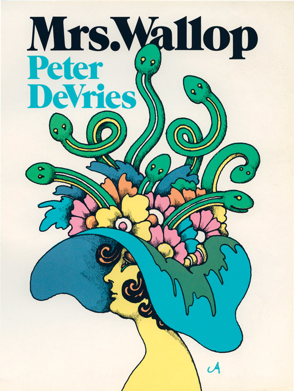 John Alcorn, book cover for Mrs. Wallop by Peter DeVries, 1970
credit: John Alcorn: Evolution by Design
John Alcorn, book cover for Mrs. Wallop by Peter DeVries, 1970
credit: John Alcorn: Evolution by Design John Alcorn, book cover for A Spy in the Family by Alec Waugh, 1970
credit: John Alcorn: Evolution by Design
John Alcorn, book cover for A Spy in the Family by Alec Waugh, 1970
credit: John Alcorn: Evolution by Design John Alcorn, poster design, Nassau County Multiple Sclerosis Society, 1966
credit: John Alcorn: Evolution by Design
John Alcorn, poster design, Nassau County Multiple Sclerosis Society, 1966
credit: John Alcorn: Evolution by Design John Alcorn, book cover for I Love Galesburg in the Springtime by Jack Finney, 1963
credit: John Alcorn: Evolution by Design
John Alcorn, book cover for I Love Galesburg in the Springtime by Jack Finney, 1963
credit: John Alcorn: Evolution by Design John Alcorn, from a series of unpublished political posters concerning work safety, 1972
credit: John Alcorn: Evolution by Design
John Alcorn, from a series of unpublished political posters concerning work safety, 1972
credit: John Alcorn: Evolution by Design John Alcorn, editorial illus., 1980s
credit: John Alcorn: Evolution by Design
John Alcorn, editorial illus., 1980s
credit: John Alcorn: Evolution by Design John Alcorn, design for Morgan Press note cards and stationery, 1968
credit: John Alcorn: Evolution by Design
John Alcorn, design for Morgan Press note cards and stationery, 1968
credit: John Alcorn: Evolution by Design John Alcorn, illustration for the book cover of an Italian edition of Watership Down, 1974
credit: John Alcorn: Evolution by Design
Also read Steven Heller's article on the book.
Previously:
--Milton Glaser on 50 Watts
--Book Covers of Manny Schongut
This post first appeared on Nov. 5, 2014 on 50 Watts
John Alcorn, illustration for the book cover of an Italian edition of Watership Down, 1974
credit: John Alcorn: Evolution by Design
Also read Steven Heller's article on the book.
Previously:
--Milton Glaser on 50 Watts
--Book Covers of Manny Schongut
This post first appeared on Nov. 5, 2014 on 50 Watts
 Endre Nemes
Vardag under Trettioåriga kriget (Everyday Life during the Thirty Years' War)
Oil and tempera on canvas
1977
Bio from wikipedia:Born Endre Nágel in Pécsvárad, Hungary, in 1909, he changed his name to Nemes in 1928. His family soon moved to the small town of Igló (then part of Austro-Hungarian monarchy, later Czechoslovakia, now Slovakia). He later lived in Vienna (1927) where he studied philosophy before returning to Slovakia, working as a journalist and publishing poetry. In 1930, he moved to Prague where he became a cartoonist. Whilst in Prague, he studied at the Prague Art Academy, where he met Peter Weiss and Bernard Reder and collaborated with Jakub Bauernfreund. Nemes held his first exhibition with Jakub Bauernfreund at the Dr. Feigl Gallery. As a Jew, he escaped from Czechoslovakia before World War II, was in Helsinki in 1938, traveled through Finland and Norway, and ended up in Sweden where he held his first solo exhibition in 1941 in Stockholm. Just prior to Weiss's March 1941 exhibition at Masshallen, Brunkebergsplate, Nemes had shown his work at the same venue.
He became a Swedish citizen in 1948. From 1947 to 1955, he was director and innovator for Valand School of Fine Arts in Gothenburg. He also worked on sets and costumes for the opera house and the municipal theatre. His fanciful paintings often included harlequins and clocks. Nemes became known for several large public art works and was a pioneer in Sweden in the use of enamels in public art, designing the façade of the municipal administration building in Alafors and the Zodiak Clock in the center of Västertorp. Along with Max Walter Svanberg, C.O. Hultén, Adja Yunkers, and Carl O. Svensson, Nemes was a founder of the Minotaur group. In the end of the 1950s, he showed in Zurich and Freiburg, and there was a subsequent retrospective in Lund, Prague, and Salzburg.
In 1965, he was awarded a Swedish State stipend and held a notable exhibition at the Drian Galleries in London. His work can be found in the Museum of Modern Art in Stockholm, Philadelphia Art Museum and Brooklyn Museum in the US, the Slovak National Gallery in Bratislava, and the Ferenc Martyn Museum in Pécs. In 1984, Nemes received an honorary doctorate from the University of Gothenburg. The same year the three large tapestries he designed for Första Sparbanken in Stockholm were completed at Jindřichův Hradec in Czechoslovakia under the direction of Josef Müller. Two more, for Volvo's headquarters in Gothenburg, followed in 1985. Härryda Municipality in particular has a large collection of works by Nemes. About twenty of his drawings were reported stolen in December 2008 from Ystad Art Museum. However, a month later, the drawings were found in the museum basement. Nemes was a friend of the Estonian poet and publicist Ilmar Laaban.
Nemes died on September 22, 1985 in Stockholm.
Also see this timeline of his life and work.
Endre Nemes
Vardag under Trettioåriga kriget (Everyday Life during the Thirty Years' War)
Oil and tempera on canvas
1977
Bio from wikipedia:Born Endre Nágel in Pécsvárad, Hungary, in 1909, he changed his name to Nemes in 1928. His family soon moved to the small town of Igló (then part of Austro-Hungarian monarchy, later Czechoslovakia, now Slovakia). He later lived in Vienna (1927) where he studied philosophy before returning to Slovakia, working as a journalist and publishing poetry. In 1930, he moved to Prague where he became a cartoonist. Whilst in Prague, he studied at the Prague Art Academy, where he met Peter Weiss and Bernard Reder and collaborated with Jakub Bauernfreund. Nemes held his first exhibition with Jakub Bauernfreund at the Dr. Feigl Gallery. As a Jew, he escaped from Czechoslovakia before World War II, was in Helsinki in 1938, traveled through Finland and Norway, and ended up in Sweden where he held his first solo exhibition in 1941 in Stockholm. Just prior to Weiss's March 1941 exhibition at Masshallen, Brunkebergsplate, Nemes had shown his work at the same venue.
He became a Swedish citizen in 1948. From 1947 to 1955, he was director and innovator for Valand School of Fine Arts in Gothenburg. He also worked on sets and costumes for the opera house and the municipal theatre. His fanciful paintings often included harlequins and clocks. Nemes became known for several large public art works and was a pioneer in Sweden in the use of enamels in public art, designing the façade of the municipal administration building in Alafors and the Zodiak Clock in the center of Västertorp. Along with Max Walter Svanberg, C.O. Hultén, Adja Yunkers, and Carl O. Svensson, Nemes was a founder of the Minotaur group. In the end of the 1950s, he showed in Zurich and Freiburg, and there was a subsequent retrospective in Lund, Prague, and Salzburg.
In 1965, he was awarded a Swedish State stipend and held a notable exhibition at the Drian Galleries in London. His work can be found in the Museum of Modern Art in Stockholm, Philadelphia Art Museum and Brooklyn Museum in the US, the Slovak National Gallery in Bratislava, and the Ferenc Martyn Museum in Pécs. In 1984, Nemes received an honorary doctorate from the University of Gothenburg. The same year the three large tapestries he designed for Första Sparbanken in Stockholm were completed at Jindřichův Hradec in Czechoslovakia under the direction of Josef Müller. Two more, for Volvo's headquarters in Gothenburg, followed in 1985. Härryda Municipality in particular has a large collection of works by Nemes. About twenty of his drawings were reported stolen in December 2008 from Ystad Art Museum. However, a month later, the drawings were found in the museum basement. Nemes was a friend of the Estonian poet and publicist Ilmar Laaban.
Nemes died on September 22, 1985 in Stockholm.
Also see this timeline of his life and work.
 Endre Nemes
Den stora pantomimen (The Great Pantomime)
Oil and tempera on canvas
1943–44
Endre Nemes
Den stora pantomimen (The Great Pantomime)
Oil and tempera on canvas
1943–44
 Endre Nemes
Den stora paraden (The Great Parade)
Casein tempera on panel
1944
Endre Nemes
Den stora paraden (The Great Parade)
Casein tempera on panel
1944 Endre Nemes
Inviter (Invitations)
Acrylic and oil on canvas
1967
Endre Nemes
Inviter (Invitations)
Acrylic and oil on canvas
1967 Endre Nemes
From Cuneiform to the Present
Acrylic and oil on canvas
1970–71
Endre Nemes
From Cuneiform to the Present
Acrylic and oil on canvas
1970–71
 Endre Nemes
Förhörsrekvisita II (Interrogation Tool II)
Acrylic and oil on canvas
1969–71
Endre Nemes
Förhörsrekvisita II (Interrogation Tool II)
Acrylic and oil on canvas
1969–71
 Endre Nemes
Örat (The Ear)
Acrylic and oil on canvas
1968–72
Endre Nemes
Örat (The Ear)
Acrylic and oil on canvas
1968–72
 Endre Nemes
I sfinxens tecken (Sign of the Sphinx)
Oil and acrylic on canvas
1967
Endre Nemes
I sfinxens tecken (Sign of the Sphinx)
Oil and acrylic on canvas
1967 Endre Nemes
Akbrobat, oh II ! (Acrobat, oh II !)
Oil and acrylic on canvas
1967
Endre Nemes
Akbrobat, oh II ! (Acrobat, oh II !)
Oil and acrylic on canvas
1967 Endre Nemes
Fältherrens epitaf (The Commander's Epitaph)
Oil and acrylic on canvas
1972–77
Endre Nemes
Fältherrens epitaf (The Commander's Epitaph)
Oil and acrylic on canvas
1972–77
 Endre Nemes
Stickande ögon (Piercing Eyes)
Oil, acrylic and tempera on canvas
1967–77
Endre Nemes
Stickande ögon (Piercing Eyes)
Oil, acrylic and tempera on canvas
1967–77
 Endre Nemes
Medeltida analogier (Medieval Analogies)
Oil and acrylic on canvas
1970–75
Endre Nemes
Medeltida analogier (Medieval Analogies)
Oil and acrylic on canvas
1970–75
 Endre Nemes
Målskyttarna (The Target-Shooters)
Oil and acrylic on canvas
1967–71–76
Endre Nemes
Målskyttarna (The Target-Shooters)
Oil and acrylic on canvas
1967–71–76
 Endre Nemes
Fönster i tiden (Window of Time)
Acrylic and tempera on canvas
1971–81
Endre Nemes
Fönster i tiden (Window of Time)
Acrylic and tempera on canvas
1971–81
 Endre Nemes
Galileis ekvationer (Galileo's Equations)
Oil and acrylic on canvas
1970–74
Endre Nemes
Galileis ekvationer (Galileo's Equations)
Oil and acrylic on canvas
1970–74
 Endre Nemes
Anatomistudier (Anatomy Studies)
Oil and tempera on canvas
1978–79
Endre Nemes
Anatomistudier (Anatomy Studies)
Oil and tempera on canvas
1978–79
 Endre Nemes
Komposition
Oil and tempera on panel
Not signed or dated
Endre Nemes
Komposition
Oil and tempera on panel
Not signed or dated Endre Nemes
Métropolitaine
Acrylic, tempera and oil on canvas
1970–83
Endre Nemes
Métropolitaine
Acrylic, tempera and oil on canvas
1970–83
 Endre Nemes
Figure
Oil and acrylic on canvas
1983
Endre Nemes
Figure
Oil and acrylic on canvas
1983 Endre Nemes
Slussen (The Floodgate)
Acrylic on canvas
not dated
Endre Nemes
Slussen (The Floodgate)
Acrylic on canvas
not dated Endre Nemes
Mannen med symaskinen (The Man with the Sewing Machine)
Oil and tempera on canvas
1983
Endre Nemes
Mannen med symaskinen (The Man with the Sewing Machine)
Oil and tempera on canvas
1983 Endre Nemes
De stora förebilderna (The Great Forerunners)
Oil and tempera on canvas
1982
Endre Nemes
De stora förebilderna (The Great Forerunners)
Oil and tempera on canvas
1982
 Endre Nemes
Figur med skoblock (Figure with Shoe Tree)
Oil on canvas
1982
Endre Nemes
Figur med skoblock (Figure with Shoe Tree)
Oil on canvas
1982 Endre Nemes
Arkitekten (The Architect)
Oil and tempera on canvas
1982
Endre Nemes
Arkitekten (The Architect)
Oil and tempera on canvas
1982 Endre Nemes
Den skräckslagna flykten (The Terrifying Escape)
Oil and tempera on canvas
1983
Endre Nemes
Den skräckslagna flykten (The Terrifying Escape)
Oil and tempera on canvas
1983
 Endre Nemes
Skillingtryck (Broadsheet)
Oil and tempera on canvas
1982–83
Endre Nemes
Skillingtryck (Broadsheet)
Oil and tempera on canvas
1982–83
 Endre Nemes
Möte med barocken (Encounter with the Baroque)
Oil, acrylic and tempera on canvas
1968–69
See all posts tagged "Sweden" on 50 Watts
Previously: a post on Max Walter Svanberg for But Does it Float
This post first appeared on December 1, 2014 on 50 Watts
Endre Nemes
Möte med barocken (Encounter with the Baroque)
Oil, acrylic and tempera on canvas
1968–69
See all posts tagged "Sweden" on 50 Watts
Previously: a post on Max Walter Svanberg for But Does it Float
This post first appeared on December 1, 2014 on 50 Watts
 Samplerman comic by Yvang
 Samplerman comic by Yvang
 Samplerman comic by Yvang
 Samplerman comic by Yvang
 Samplerman comic by Yvang
 Samplerman comic by Yvang
 Samplerman comic by Yvang
 Samplerman comic by Yvang
 Samplerman comic by Yvang
 Samplerman comic by Yvang
 Samplerman comic by Yvang
 Samplerman comic by Yvang
 Samplerman comic by Yvang
 Samplerman comic by Yvang
Dear internet editors: When you reblog more than 50% of a post you raise my blood pressure and hence shorten my lifespan.
This post first appeared on January 26, 2015 on 50 Watts
Samplerman comic by Yvang
Dear internet editors: When you reblog more than 50% of a post you raise my blood pressure and hence shorten my lifespan.
This post first appeared on January 26, 2015 on 50 Watts I look forward to reading and collecting books by the British author and illustrator Joyce Dennys (1893–1991). You can see a gallery of her paintings at the BBC's Your Paintings site. Bloomsbury republished her two collections of epistolary fiction Henrietta's War and Henrietta Sees It Through. Nonsuch Book describes the first and Book Snob the second.
Evoe was the pseudonym of E. V. Knox, father of Penelope Fitzgerald. (See her book The Knox Brothers.)
I look forward to reading and collecting books by the British author and illustrator Joyce Dennys (1893–1991). You can see a gallery of her paintings at the BBC's Your Paintings site. Bloomsbury republished her two collections of epistolary fiction Henrietta's War and Henrietta Sees It Through. Nonsuch Book describes the first and Book Snob the second.
Evoe was the pseudonym of E. V. Knox, father of Penelope Fitzgerald. (See her book The Knox Brothers.)


 Dear internet editors: When you reblog more than 50% of a post you raise my blood pressure and hence shorten my lifespan.
This post first appeared on January 27, 2015 on 50 Watts
Dear internet editors: When you reblog more than 50% of a post you raise my blood pressure and hence shorten my lifespan.
This post first appeared on January 27, 2015 on 50 Watts From the print series Blues Build the Temple by Trevor Naud
 From the print series Blues Build the Temple by Trevor Naud
 From the print series Blues Build the Temple by Trevor Naud
 From the print series Blues Build the Temple by Trevor Naud
 From the print series Blues Build the Temple by Trevor Naud
 From the print series Blues Build the Temple by Trevor Naud
 From the print series Blues Build the Temple by Trevor Naud
 From the print series Blues Build the Temple by Trevor Naud
Dear internet editors: When you reblog more than 50% of a post you raise my blood pressure and hence shorten my lifespan.
This post first appeared on January 28, 2015 on 50 Watts
From the print series Blues Build the Temple by Trevor Naud
Dear internet editors: When you reblog more than 50% of a post you raise my blood pressure and hence shorten my lifespan.
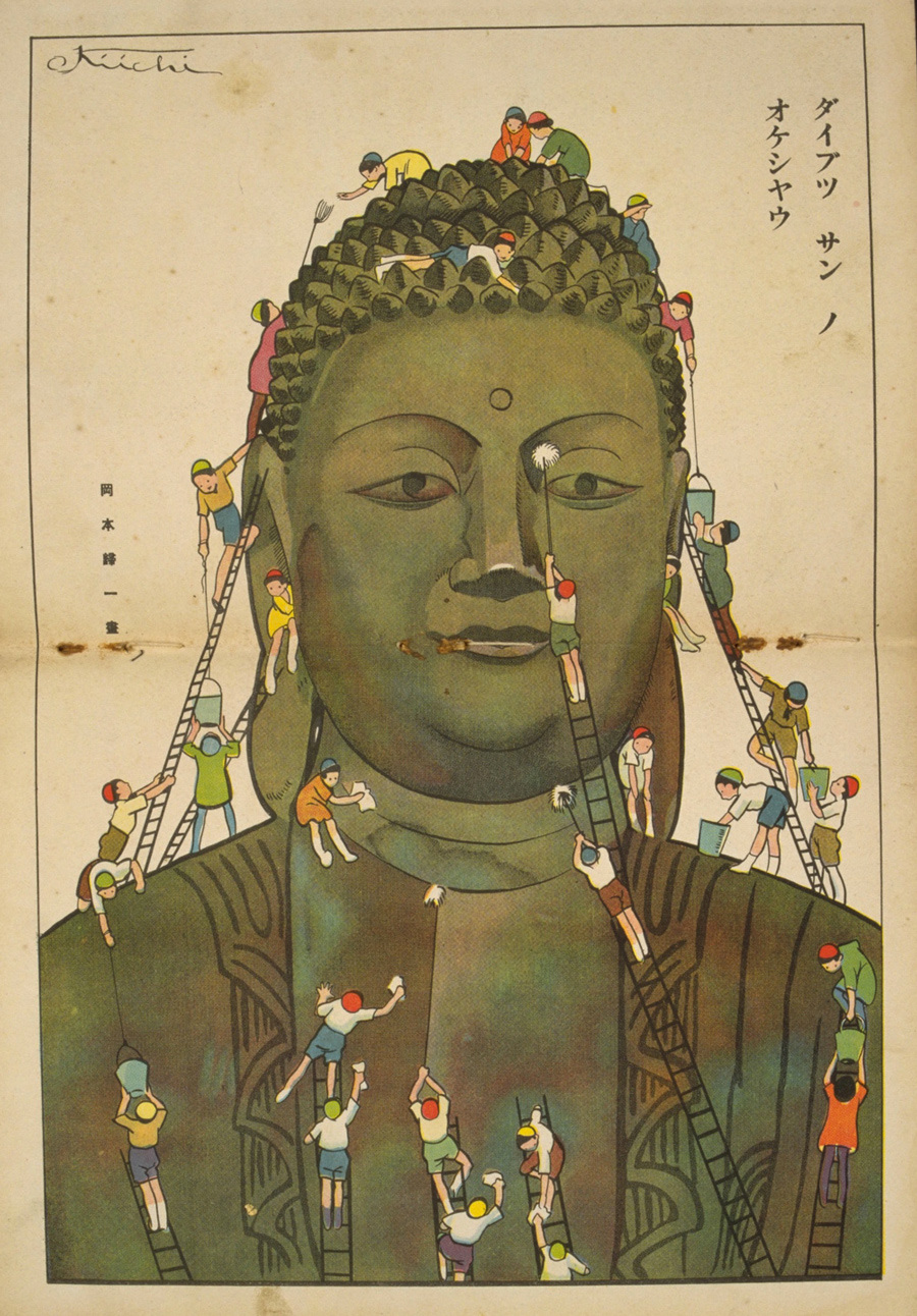
This post first appeared on January 28, 2015 on 50 Watts Bio of Okamoto Kiichi (1888–1930) by the Saru Gallery:Okamoto Kiichi studied together with Kuroda Seiki at the school of Hakubakai. He first exhibited woodblock prints in 1912. He was a member of various artists' societies, and contributed his self-carved woodblock prints to a number of magazines, one of which was Kindai no Yôga. In the latter part of his career he created designs for stage scenery and also worked as an illustrator of children's stories. His prints were also used as book illustrations by Onchi Kôshirô.
A longer bio can be found at the Kodomo No Kuni site, and there's even a wikipedia entry. Edmond Dulac and Arthur Rackham have been cited as influences. I think I also see Benjamin Rabier in some of his animal illustrations. There's one small collection of his work currently available (in Japanese).
About the site that houses 9000 images from the almost 300 issues of Kodomo no kuni: "This program was created as part of the Picture Book Gallery project of the International Library of Children's Literature to introduce in digital form the story of the picture book genre from its beginnings until the present. The program was designed to reproduce the works contained in the journal Kodomo no kuni [Children's Land] and convert them to digital images, which have been edited and titled and made available to the public as a virtual exhibit."
Bio of Okamoto Kiichi (1888–1930) by the Saru Gallery:Okamoto Kiichi studied together with Kuroda Seiki at the school of Hakubakai. He first exhibited woodblock prints in 1912. He was a member of various artists' societies, and contributed his self-carved woodblock prints to a number of magazines, one of which was Kindai no Yôga. In the latter part of his career he created designs for stage scenery and also worked as an illustrator of children's stories. His prints were also used as book illustrations by Onchi Kôshirô.
A longer bio can be found at the Kodomo No Kuni site, and there's even a wikipedia entry. Edmond Dulac and Arthur Rackham have been cited as influences. I think I also see Benjamin Rabier in some of his animal illustrations. There's one small collection of his work currently available (in Japanese).
About the site that houses 9000 images from the almost 300 issues of Kodomo no kuni: "This program was created as part of the Picture Book Gallery project of the International Library of Children's Literature to introduce in digital form the story of the picture book genre from its beginnings until the present. The program was designed to reproduce the works contained in the journal Kodomo no kuni [Children's Land] and convert them to digital images, which have been edited and titled and made available to the public as a virtual exhibit."


 Previous posts from this archive: Hatsuyama Shigeru and Takeo Takei.
This post first appeared on Feb. 5, 2015 on 50 Watts
Dear internet editors: When you reblog more than 50% of a post you raise my blood pressure and hence shorten my lifespan.
Previous posts from this archive: Hatsuyama Shigeru and Takeo Takei.
This post first appeared on Feb. 5, 2015 on 50 Watts
Dear internet editors: When you reblog more than 50% of a post you raise my blood pressure and hence shorten my lifespan.
 1924, illus. Romà Bonet aka BON
These scans come from the sprawling Hemeroteca Digital database of the National Library of Spain. (I did some digital scrubbing.) Though the magazine ran weekly from 1895 to 1933, the colorful covers appear from 1919 to 1930. While scrolling through the hundreds of mostly deco covers I also noticed a strong Wiener Werkstätte vibe.
I've featured a handful of the illustrators before. (Unfortunately I couldn't read some of their signatures.) See my tag for Spain. "BON" showed up in my "Catalonian Book Fetishists" series.
Thanks go to Alfonso Melendez for bringing me to this crazy database.
1924, illus. Romà Bonet aka BON
These scans come from the sprawling Hemeroteca Digital database of the National Library of Spain. (I did some digital scrubbing.) Though the magazine ran weekly from 1895 to 1933, the colorful covers appear from 1919 to 1930. While scrolling through the hundreds of mostly deco covers I also noticed a strong Wiener Werkstätte vibe.
I've featured a handful of the illustrators before. (Unfortunately I couldn't read some of their signatures.) See my tag for Spain. "BON" showed up in my "Catalonian Book Fetishists" series.
Thanks go to Alfonso Melendez for bringing me to this crazy database.
 1925, illus. Salvador Bartolozzi (I'm guessing)
More Bartolozzi
1925, illus. Salvador Bartolozzi (I'm guessing)
More Bartolozzi 1928
1928 1925, illus. Tono
Tono = Antonio Lara de Gavilán (1896-1978)
1925, illus. Tono
Tono = Antonio Lara de Gavilán (1896-1978)
 1923, illus. Romà Bonet aka BON
 1925, illus. E. Santanya (?)
 1925
1925 1923
1923 1920, illus. Juan Mezquita Almer
 1930, illus. Rafael de Penagos
More by this artist
1930, illus. Rafael de Penagos
More by this artist 1930
1930 1926
1926 1926, illus. Ramón Manchón (?).
Must be responsible for the cover above this one, too.
1926, illus. Ramón Manchón (?).
Must be responsible for the cover above this one, too.
 1919
1919 1923, illus. Ballester Marco
 1923, Romà Bonet aka BON
 1924, Romà Bonet aka BON
 1926
1926 1928
1928 1925, illus. Muro
 1927, illus. de la Vega
 1928, illus. Marquez
 1925, illus. Soriano
 1919, illus. Tono
 1920, detail (my guess is Tono)
See all posts from Spain
Dear internet editors: When you reblog more than 50% of a post you raise my blood pressure and hence shorten my lifespan.
This post first appeared on February 12, 2015 on 50 Watts
1920, detail (my guess is Tono)
See all posts from Spain
Dear internet editors: When you reblog more than 50% of a post you raise my blood pressure and hence shorten my lifespan.
This post first appeared on February 12, 2015 on 50 Watts
 Windel, Ex Libris Dr Harmath
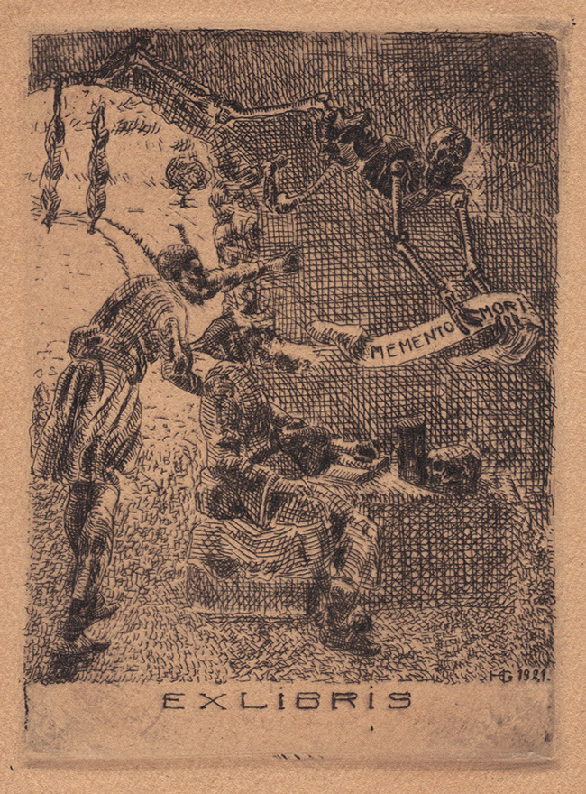 signed HG 1921
 Albessart
 Jens Lambrecht
 Dan Burne Jones
 Gieger
 Hristo Kern
 K Antioukhin
 Hirsto Naidenov
 Jame Groleau etching
 Jame Groleau etching
See all bookplate posts on 50 Watts (including parts 1 through 12 of this series).
Dear internet editors: When you reblog more than 50% of a post you raise my blood pressure and hence shorten my lifespan.
This post first appeared on March 16, 2015 on 50 Watts
Jame Groleau etching
See all bookplate posts on 50 Watts (including parts 1 through 12 of this series).
Dear internet editors: When you reblog more than 50% of a post you raise my blood pressure and hence shorten my lifespan.
This post first appeared on March 16, 2015 on 50 Watts
 Cover by Kishida Ryūsei for Shirakaba, 1918
These scans are courtesy of Jimoto and his always-inspiring site Dassaishooku. You can read about Kishida Ryūsei (1891–1929) on wikipedia and at the Hiroshima Museum of Art. Ryūsei is well-known for his portraits of his daughter (Reiko), but I had not seen these exquisite book illustrations until Dassaishooku's posts.
The first eight images are his covers for Shirakaba ("White Birch"), the literary journal of the Shirakaba-ha (“White Birch School”). From Brittanica:The members of this group...rejected the Confucian worldview and the naturalism of the earlier generation and had little patience with Japanese traditions. Shirakaba was perhaps the most identifiable means by which they expressed their eagerness for new styles of expression. The visual artists among them were especially interested in German Expressionism, Post-Impressionism, and other avant-garde movements of the West. All worked to spread the ideologies of individualism, idealism, and humanitarianism—largely derived from the writings of Leo Tolstoy—throughout Japanese society. The activities of the Shirakaba-ha included not only publication of the journal but art exhibitions and even social experiments, such as the Atarashiki Mura (“New Village”) movement, a utopian community designed to incorporate artistic activities into the everyday physical labour required of its inhabitants.
Cover by Kishida Ryūsei for Shirakaba, 1918
These scans are courtesy of Jimoto and his always-inspiring site Dassaishooku. You can read about Kishida Ryūsei (1891–1929) on wikipedia and at the Hiroshima Museum of Art. Ryūsei is well-known for his portraits of his daughter (Reiko), but I had not seen these exquisite book illustrations until Dassaishooku's posts.
The first eight images are his covers for Shirakaba ("White Birch"), the literary journal of the Shirakaba-ha (“White Birch School”). From Brittanica:The members of this group...rejected the Confucian worldview and the naturalism of the earlier generation and had little patience with Japanese traditions. Shirakaba was perhaps the most identifiable means by which they expressed their eagerness for new styles of expression. The visual artists among them were especially interested in German Expressionism, Post-Impressionism, and other avant-garde movements of the West. All worked to spread the ideologies of individualism, idealism, and humanitarianism—largely derived from the writings of Leo Tolstoy—throughout Japanese society. The activities of the Shirakaba-ha included not only publication of the journal but art exhibitions and even social experiments, such as the Atarashiki Mura (“New Village”) movement, a utopian community designed to incorporate artistic activities into the everyday physical labour required of its inhabitants.
 Cover by Kishida Ryūsei for Shirakaba, 1918
 Cover by Kishida Ryūsei for Shirakaba, 1919
 Cover by Kishida Ryūsei for Shirakaba, 1919
 Cover by Kishida Ryūsei for Shirakaba, 1919
 Cover by Kishida Ryūsei for Shirakaba, 1920
 Cover by Kishida Ryūsei for Shirakaba, 1921
 Cover by Kishida Ryūsei for Shirakaba, 1922
The following images are Ryūsei's illustrations for a retelling of a Japanese myth by White Birch Society member Saneatsu Mushanokōji.
From wikipedia:Kachi-kachi Yama (かちかち山?, kachi-kachi being an onomatopoeia of the sound a fire makes and yama meaning "mountain", roughly translates to "Fire-Crackle Mountain"), also known as Kachi-Kachi Mountain and The Farmer and the Badger, is a Japanese folktale in which a tanuki (Japanese raccoon dog) is the villain, rather than the more usual boisterous, well-endowed alcoholic.
Also see this Japanese page about the book.
It's hard not to love this rabbit.
Cover by Kishida Ryūsei for Shirakaba, 1922
The following images are Ryūsei's illustrations for a retelling of a Japanese myth by White Birch Society member Saneatsu Mushanokōji.
From wikipedia:Kachi-kachi Yama (かちかち山?, kachi-kachi being an onomatopoeia of the sound a fire makes and yama meaning "mountain", roughly translates to "Fire-Crackle Mountain"), also known as Kachi-Kachi Mountain and The Farmer and the Badger, is a Japanese folktale in which a tanuki (Japanese raccoon dog) is the villain, rather than the more usual boisterous, well-endowed alcoholic.
Also see this Japanese page about the book.
It's hard not to love this rabbit.
 Illustration by Kishida Ryūsei for "Fire-Crackle Mountain," 1917
 Illustration by Kishida Ryūsei for "Fire-Crackle Mountain," 1917
 Illustration by Kishida Ryūsei for "Fire-Crackle Mountain," 1917
 Illustration by Kishida Ryūsei for "Fire-Crackle Mountain," 1917
 Illustration by Kishida Ryūsei for "Fire-Crackle Mountain," 1917
 Illustration by Kishida Ryūsei for "Fire-Crackle Mountain," 1917
 Illustration by Kishida Ryūsei for "Fire-Crackle Mountain," 1917
 Book binding illustration by Kishida Ryūsei, 1917
And to close, a couple illustrations from Saneatsu Mushanokōji's retelling of the myth "Hanasaka Jiisan."
Book binding illustration by Kishida Ryūsei, 1917
And to close, a couple illustrations from Saneatsu Mushanokōji's retelling of the myth "Hanasaka Jiisan."
 Illustration by Kishida Ryūsei for "Hanasaka Jiisan," 1917
 Illustration by Kishida Ryūsei for "Hanasaka Jiisan," 1917
I am blown away by these illustrations and I can't thank Dassaishooku enough for sharing them.
See all posts from Japan on 50 Watts
This post first appeared on March 18, 2015 on 50 Watts
Illustration by Kishida Ryūsei for "Hanasaka Jiisan," 1917
I am blown away by these illustrations and I can't thank Dassaishooku enough for sharing them.
See all posts from Japan on 50 Watts
This post first appeared on March 18, 2015 on 50 Watts
 La Esfera, May 1930
Painter and illustrator Manuel Bujados (1889–1954) was born in Viveiro in Galicia, Spain. From about 1914 to 1934, he lived the bohemian life in Madrid before heading to Bell Ville, Argentina to take over the family business. The curators of a 2009 Museo Lugo exhibit describe Bujados as well-known and respected in Spain and Latin America (at the time) for his painting and Beardsley-influenced illustrations for publications like La Esfera, Mundo Gráfico, Nuevo Mundo, and Por esos Mundos. They hoped to revive his memory with their exhibit and still host a gallery of sketches and a PDF containing the only info I can find about him.
The majority of the images in this post come from La Esfera, a lavish art publication funded by Prensa Gráfica Española, also behind Nuevo Mundo. It ran from from 1914 to the start of the Second Spanish Republic in 1931. Hemeroteca Digital has scanned 867 issues. I combed through the scans for work by Bujados. It took forever.
José Francés, art critic for La Esfera, was an important influence and guided Bujados to focus on illustration. Bujados worked there alongside Salvador Bartolozzi and Rafael de Penagos.
I would like to thank the Spanish blogger Santos Maroto for covering Bujados in three posts on his blog Final de página.
La Esfera, May 1930
Painter and illustrator Manuel Bujados (1889–1954) was born in Viveiro in Galicia, Spain. From about 1914 to 1934, he lived the bohemian life in Madrid before heading to Bell Ville, Argentina to take over the family business. The curators of a 2009 Museo Lugo exhibit describe Bujados as well-known and respected in Spain and Latin America (at the time) for his painting and Beardsley-influenced illustrations for publications like La Esfera, Mundo Gráfico, Nuevo Mundo, and Por esos Mundos. They hoped to revive his memory with their exhibit and still host a gallery of sketches and a PDF containing the only info I can find about him.
The majority of the images in this post come from La Esfera, a lavish art publication funded by Prensa Gráfica Española, also behind Nuevo Mundo. It ran from from 1914 to the start of the Second Spanish Republic in 1931. Hemeroteca Digital has scanned 867 issues. I combed through the scans for work by Bujados. It took forever.
José Francés, art critic for La Esfera, was an important influence and guided Bujados to focus on illustration. Bujados worked there alongside Salvador Bartolozzi and Rafael de Penagos.
I would like to thank the Spanish blogger Santos Maroto for covering Bujados in three posts on his blog Final de página.
 La Esfera, May 1930
 La Esfera, January 1927
 La Esfera, May 1928
 La Esfera, April 1927
 Painting, 1926 (found at a defunct Spanish website)
 La Esfera, April 1920
 La Esfera, April 1921
 La Esfera, April 1930
 La Esfera, August 1930
 La Esfera, August 1930
 La Esfera, October 1930
 La Esfera, June 1930
 From Cronicas, 1930
 La Esfera, June 1929
 La Esfera, September 1920
 La Esfera, October 1920
 La Esfera, October 1915
 La Esfera, October 1915
 La Esfera, December 1926
 La Esfera, April 1930
 La Esfera, July 1927
 La Esfera, July 1927
 La Esfera, November 1923
 La Esfera, December 1926
 La Esfera, December 1926
 La Esfera, December 1920
 Viveiro poster, 1929 (commissioned for the Exposición Iberoamericana) via Museo Lugo
 drawing, via Museo Lugo
Scans by Hemeroteca Digital.
(I've been working toward this post since . . . January 2012!)
See all posts from Spain on 50 Watts
This post first appeared on March 25, 2015 on 50 Watts
drawing, via Museo Lugo
Scans by Hemeroteca Digital.
(I've been working toward this post since . . . January 2012!)
See all posts from Spain on 50 Watts
This post first appeared on March 25, 2015 on 50 Watts
 Born in Athens, Greece and educated at the Institut Saint-Luc in Brussels, Ilan Manouach is a multidisciplinary artist whose work includes several strands of interrelated experimental comics as well as music and publishing projects. His most recent project is Shapereader, a system of forms developed to produce comics for the blind and visually impaired. Shapereader utilizes a new vocabulary of tactile language that avoids mimetic pictorialism. Funded by a grant from the Finnish Institue Koneen Säätiö, Manouach has developed the overall Shapereader system and has produced Arctic Circle, a massive 57-plate graphic novel using the Shapereader repertoire of forms. Manouach will appear at the MoCCA Arts Festival in New York, NY on April 11 and 12, 2015 to show and discuss his innovative work.
 A system of communication boards using standard braille allows readers to familiarize themselves with Shapereader vocabulary, presented above in plain English-language text.
 The 57-plate graphic novel Arctic Circle tells the story of two climatologists in the North Pole searching for patterns of climate change inscribed on ice columns.
 Manouach will discuss Shapereader in detail on a panel on comics and disability at the High Line Hotel on April 12, taking place as part of the MoCCA Arts Festival. Manouach will have sample Shapereader boards and copies of his other books on hand during the entirety of that weekend at the Rebus Books booth at the main festival site, Center 548.
 Manouach’s other work includes a series of comics détournements, including Les Schroumpfs Noirs and Katz. He will discuss these in a separate MoCCA festival panel on comics and appropriation on April 11.

 His current work in progress is the graphic novel Undercurrents. Manouach posts about current and upcoming projects and events on his Facebook page.

 Bill Kartalopoulos is a Brooklyn-based comics educator, curator and critic. He is the publisher of Rebus Books and the Series Editor for the Best American Comics.
See more posts about comics on 50 Watts
This post first appeared on March 30, 2015 on 50 Watts
Bill Kartalopoulos is a Brooklyn-based comics educator, curator and critic. He is the publisher of Rebus Books and the Series Editor for the Best American Comics.
See more posts about comics on 50 Watts
This post first appeared on March 30, 2015 on 50 Watts


